top of page

BEANS & BREW BRANDING
AND LOGO DESIGN
Project Outline
The goal of this project was to make a branding for a newly established boutique coffee shop called "Bean & Brew. Beans & Brew is a captivating and inviting coffee shop that takes pride in offering a diverse selection of specialty coffees, teas, and delightful pastries. Founded by two friends driven by their shared passion for coffee and community. The coffee shop stands as a warm haven where customers can relax, connect, and savor the rich flavors of their carefully sourced beans.
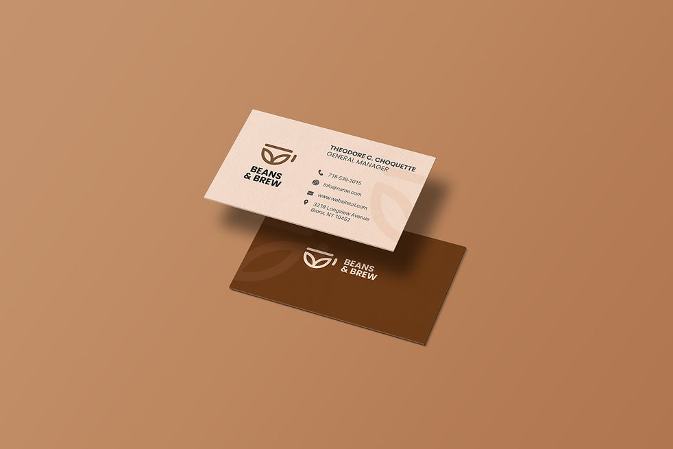
I made the logo taking into consideration that it should be minimal because minimal logos look modern, It should not be too cliche and should reflect the shops key values like community. I also chose these colors so that it should look natural and authentic.
KEYWORDS
Coffee
Lifelong friendship
Community
Authentic
Approachable
Modern
Natural

R 109
G 57
B 10
R 252
B 222
B 202
I wanted to make the branding look friendly, natural and authentic according to the brief. This is why I chose dark brown and pastel pink
The color brown is often perceived as warm, comforting, and grounding. Brown is considered as an Earthy color as it is commonly found in nature.
Pastel pink is widely regarded as a calm and soothing color. Pastel pink, specifically, is known for its gentle and delicate appearance.
LOGOTYPE: Poppins
Poppins
AA BB CC DD EE FF GG HH II JJ KK LL MM NN OO PP QQ RR SS TT UU VV WW XX YY ZZ
Sans Serif fonts look cool and give off modern vibes. I could use another script font in place of Poppins but I chose this font because I don't want to make the logo look too much friendly. The Sans Serif font gave the logo its modern look.


bottom of page